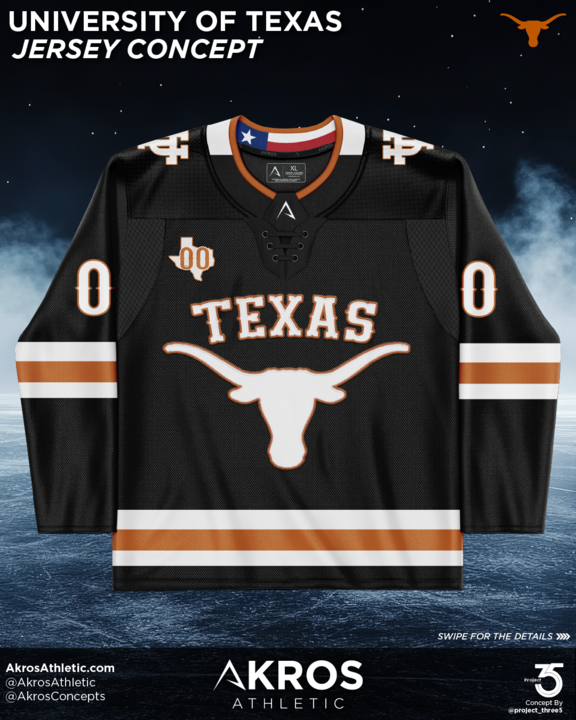
Built on Texas Heritage
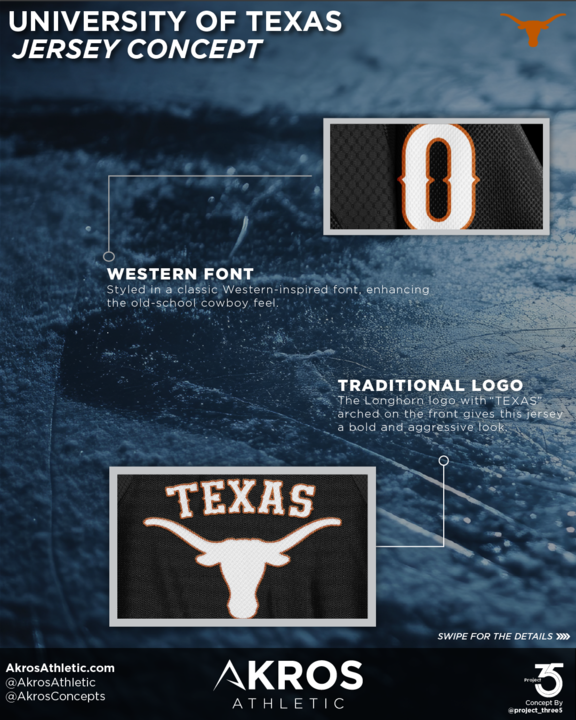
The foundation of the concept centers on the unmistakable Longhorn mark and bold “TEXAS” wordmark across the chest. Styled with a western-inspired font, the lettering brings a subtle nod to the state’s cultural roots while still reading clean and powerful on the ice. The result feels authentic to Texas without drifting into novelty.
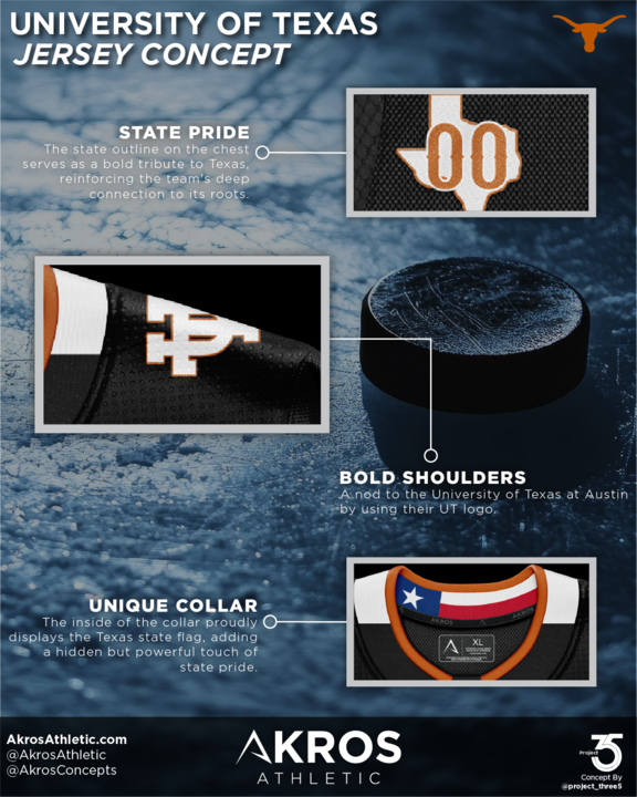
State pride continues throughout the jersey. A Texas outline crest appears on the upper chest, reinforcing the connection between team and place. Inside the collar, the Texas state flag provides a hidden detail that players carry with them each time they take the ice. These small elements create meaning beyond the surface design.
Strong shoulder construction and balanced striping give the uniform visual weight, ensuring the Longhorn identity stands out from any distance. Burnt orange accents cut through the black base to create contrast that feels both aggressive and refined. This approach keeps the look unmistakably Texas while maintaining the clean structure expected in modern hockey uniforms.
Numbers and typography were shaped for clarity, movement, and durability in a competitive environment. Every line and proportion was considered through the lens of real gameplay, not just static presentation.


