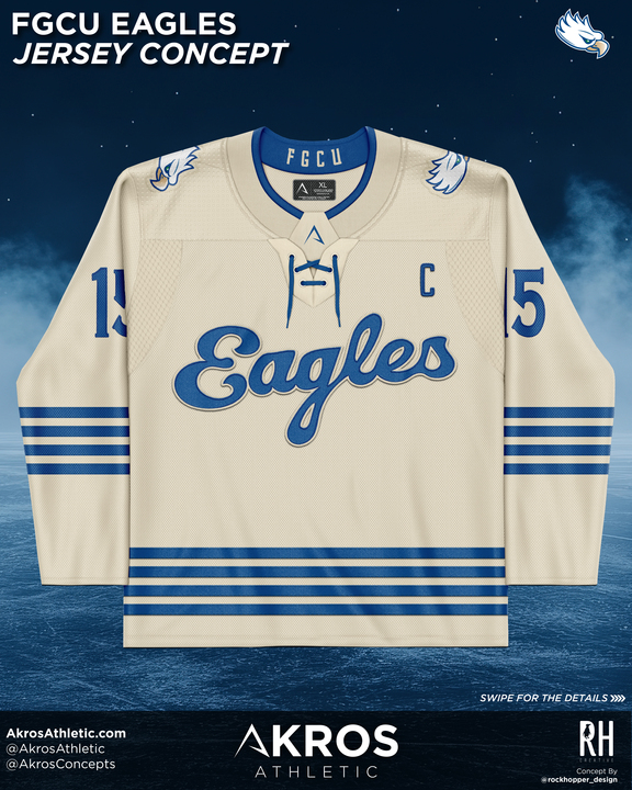
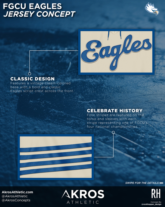
A Classic Foundation in Cream and Blue
The concept begins with a vintage cream-colored base, immediately setting a retro tone that feels timeless on the ice. Across the chest, a bold script Eagles crest delivers classic collegiate identity, while clean blue striping creates strong visual balance from shoulders to hem. The result is a uniform that feels rooted in tradition without appearing dated.
Celebrating FGCU History Through Design
Four horizontal stripes appear across the torso and sleeves, each symbolizing one of FGCU’s national championships. This subtle storytelling element transforms the jersey from simple apparel into a visual tribute to program success—an approach central to Akros Athletic’s concept philosophy.
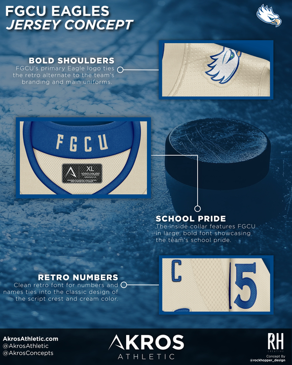
Details That Reinforce School Pride
Shoulder applications of the FGCU Eagle logo connect the retro alternate directly to the university’s primary branding system. Inside the collar, bold FGCU lettering adds another hidden layer of identity visible to the athletes who wear it. Retro-inspired numbering and name styling complete the look, tying typography, color, and cresting into one unified design language.


